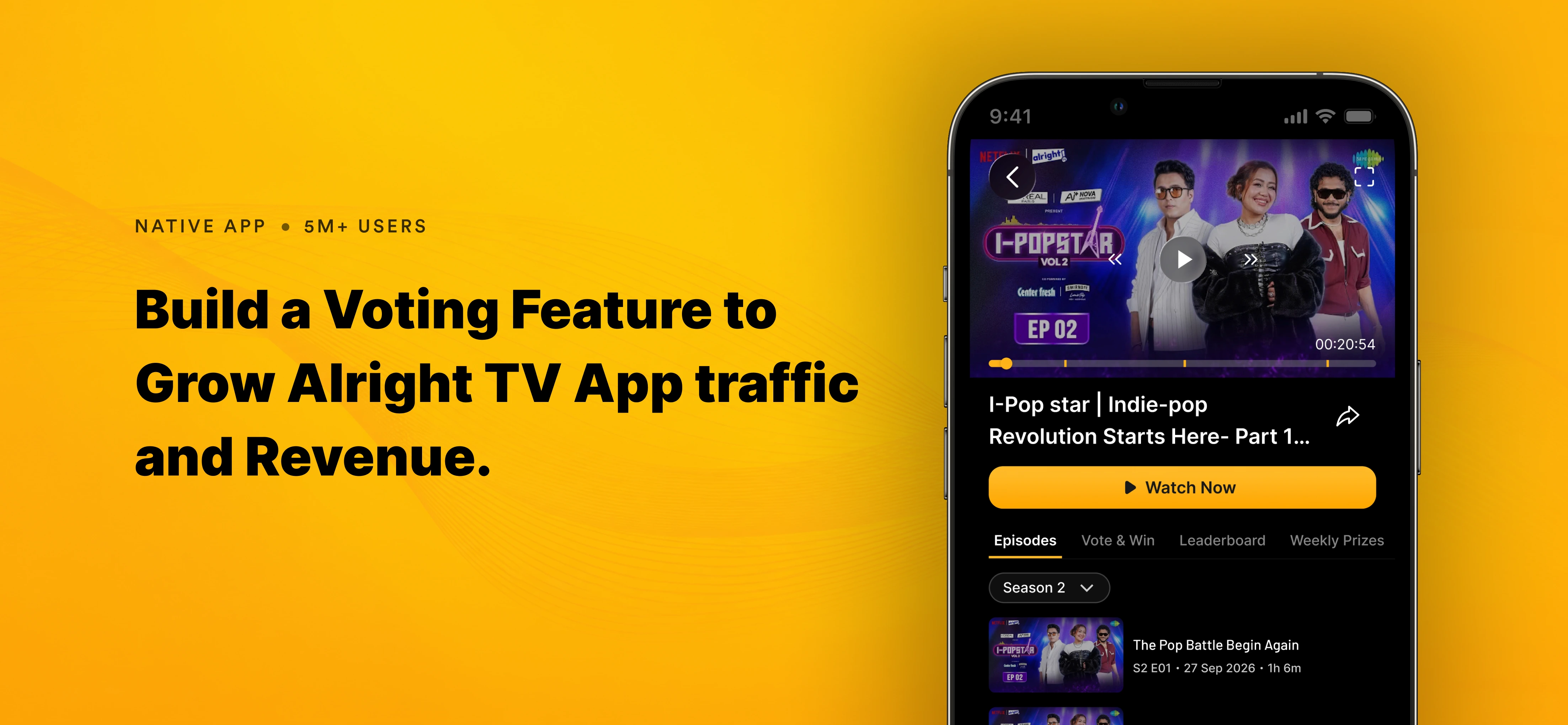
Build Voting Feature for Alright TV App
Objectives
• Turn marketing spend into subscriptions. Measure the share of new traffic that reaches the paywall and converts.
• Build a repeat-visit habit. Three episodes a week plus voting should bring users back several days a week.
• Own a music catalogue. Original songs become a library the platform keeps.
My Role
I led the design for the voting and membership experience, from research to launch, working with Product, Engineering, Data and Marketing.
Problem Identification
The brief was "add voting", but voting alone doesn't create growth. The real problems were:
- Users: watched passively and couldn't support their favourite mentor.
- Behaviour: the app is built for binge viewing, so there was no reason to return on a schedule.
- Business: too little acquired traffic reached the paywall and converted.
How might we make supporting a mentor a habit, and make upgrading feel like a natural way to support them more?
Research and Insights
I interviewed 12 viewers, reviewed fan-voting apps and reality shows, and studied in-app viewing and upgrade data.
What we learned
- Fans are loyal to a person, not a show. Voting is emotional, so it should feel quick and rewarding.
- Daily rituals build habits. One clear vote per day creates a reason to return.
- People pay when they see clear value. An upgrade only works if the benefit is obvious and fair.
- Trust matters. Users must see that their vote counted.
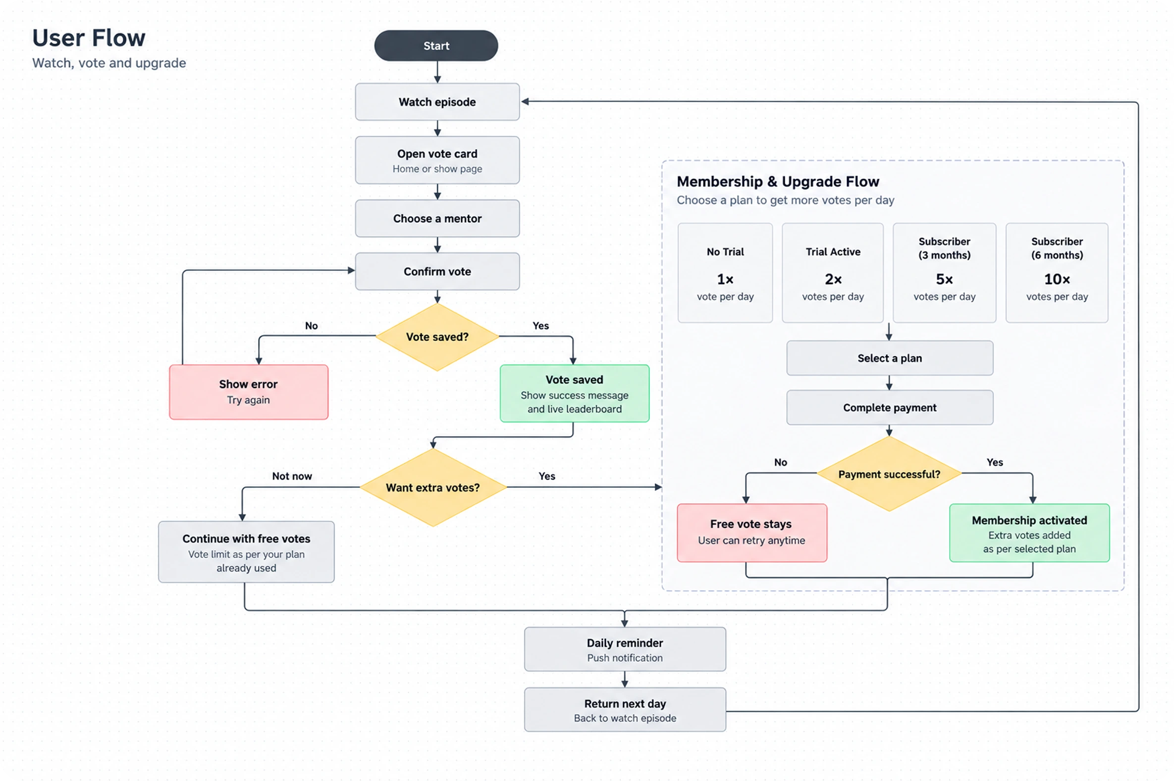
User Flow
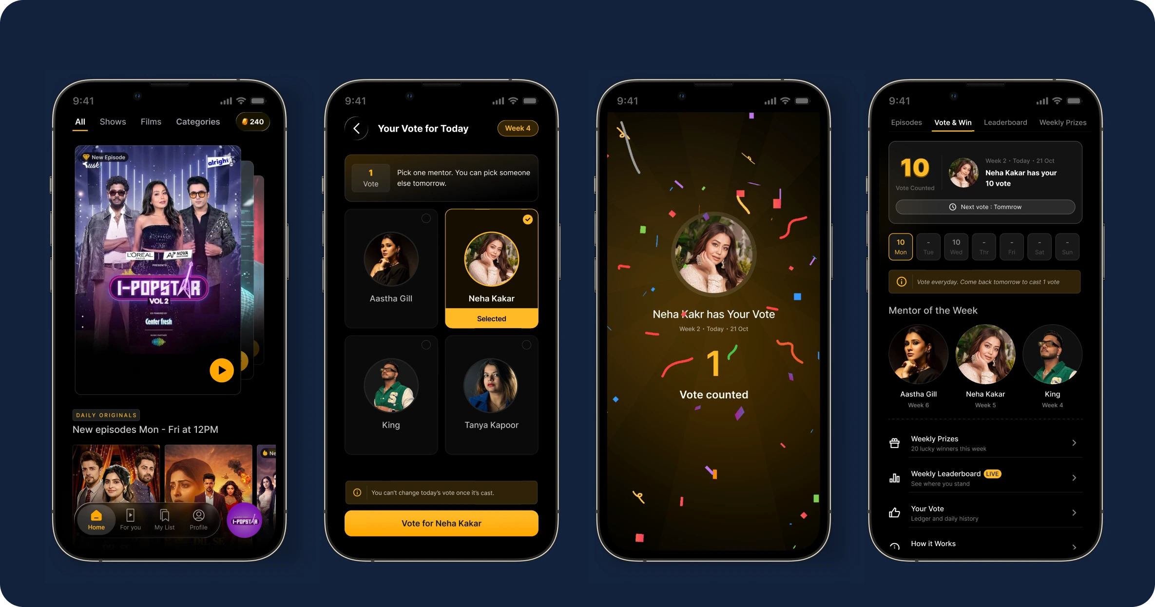
Daily vote
Habits need a daily trigger, so fans can come back every day and vote for their favourite mentor, helping make them mentor of the week. A single vote card on the show page lets them pick a mentor and confirm in two taps, then shows a clear success message and a reminder for tomorrow. A vote history lets users track how many votes they have made and whom they voted for on which day.
Leaderboard
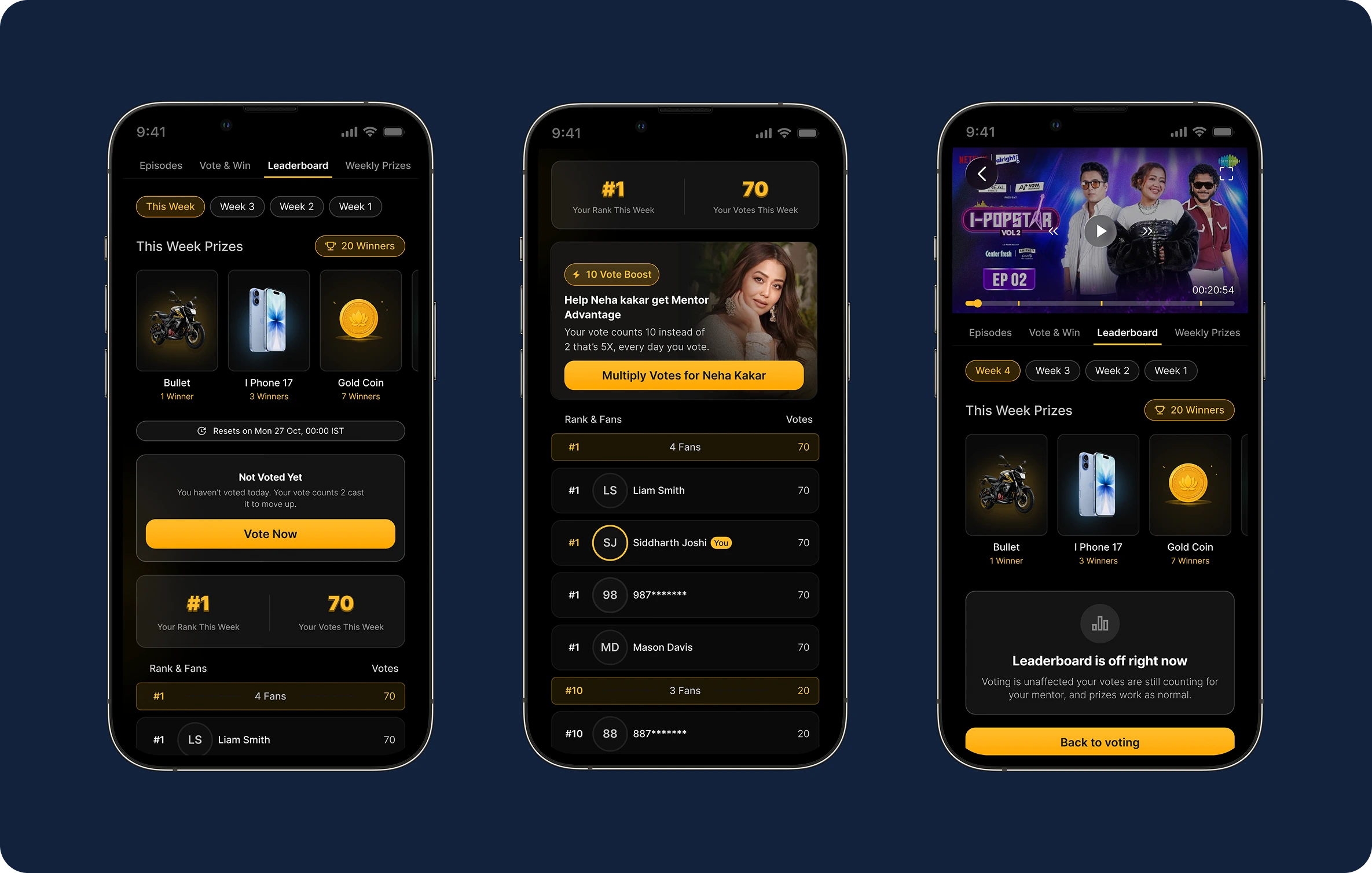
Fans need proof their votes count, and a weekly race against other voters gives them a reason to come back all week. The leaderboard opens with a carousel of this week's prizes and a countdown timer to the result announcement. Below it, the user sees their total votes this week and their rank, followed by a ranked list of other voters with their rank and total votes.
Prizes and rewards
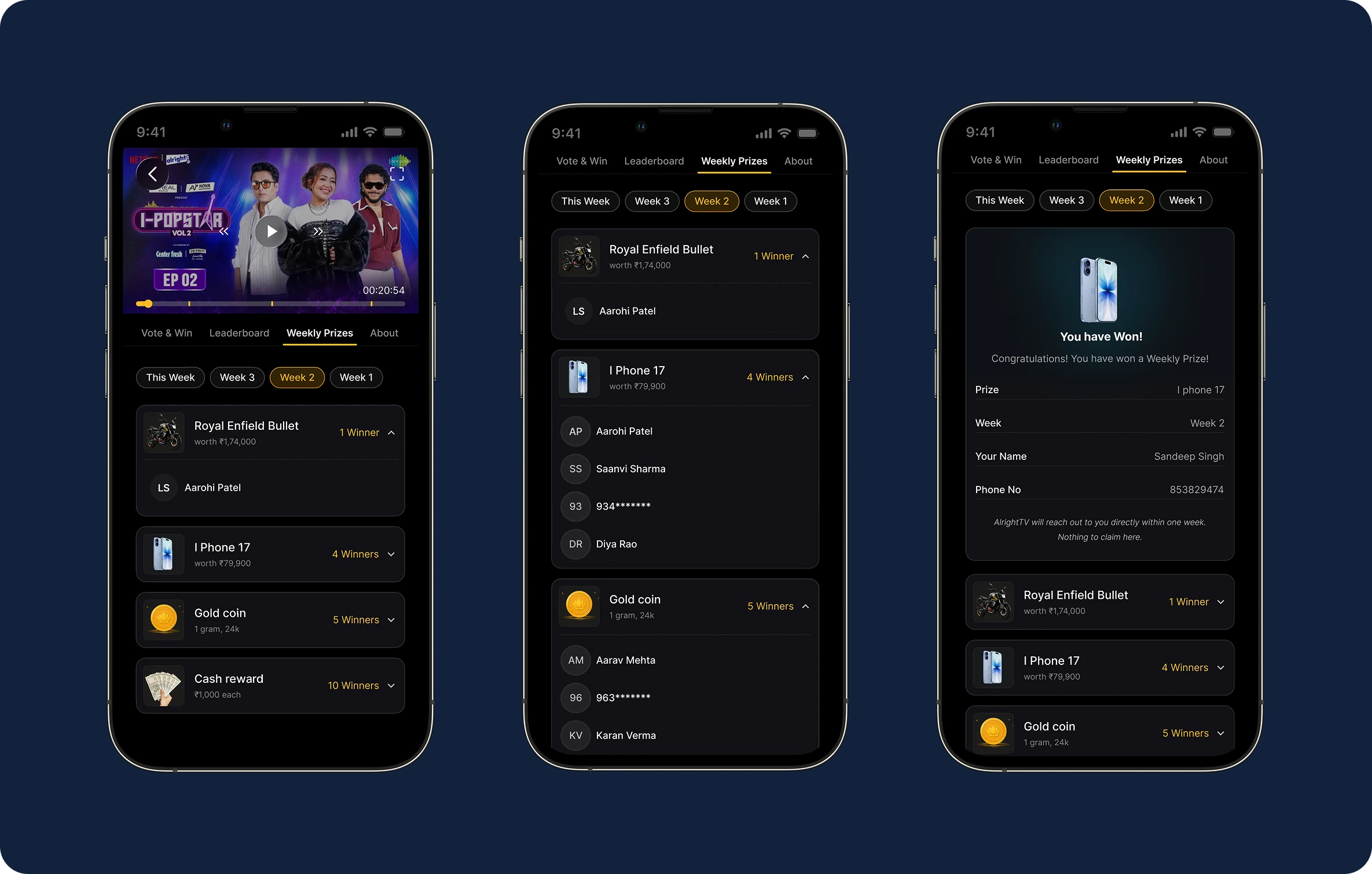
Prizes keep motivation high, and seeing past winners proves the rewards are real. The screen shows the weekly prize and reward, the total number of winners for the week, and a list of previous winners.
Validation & Iteration
To check the design, I put a clickable prototype in front of around 10 users and asked them to do what real fans would do: vote for a favourite mentor, find their rank and the weekly prize, and explain in their own words what the upgrade gives them. I watched how quickly they could vote, whether they understood the offer, and where they hesitated or dropped off. After fixing those problems, we released it
What changed after testing
- Simpler mentor cards, because users hesitated over too much information.
- The upgrade prompt moved after the vote because it felt pushy before.
- Clearer vote confirmation, because users weren't sure their vote counted.
Impact & Outcome
20%
Trial to paid
82%
Viewers returning daily
92%
Paywall conversion from the gate
Reflection & Learning
- Earning works best when it deepens what users already care about.
- Keeping the free vote fair protected both trust and revenue.
- Simple screens matter most when millions use the app at once.
Next time: test multiplier pricing earlier and track leaderboard engagement from day one.
More Case Study