WeWork On-Demand
Overview
WeWork On-Demand lets people book flexible workspace by the day, the hour or the bundle: day passes, cabins and conference rooms. The product had strong traffic but a weak funnel. Visitors arrived, looked around and left without becoming customers, which held back growth for the whole on-demand line.
The brief was to redesign the experience on both mobile and desktop so that finding and booking a space felt easy and trustworthy, and so that more visitors completed a purchase.

The Problem
WeWork On-Demand struggled to convert website visitors into customers. The path to flexible workspace was not user-friendly on mobile or desktop, so more traffic did not translate into more bookings. The goal was to close that gap: turn the visitors the site already had into paying users.
My Process
I followed a three-stage process, with each stage feeding the next.
1. Research: heuristic analysis, device metrics, user journey analysis
2. Define: competitor analysis, consumer analysis, user personas, workflow analysis, a new workflow
3. Design: user interface design and prototypes
Heuristic analysis
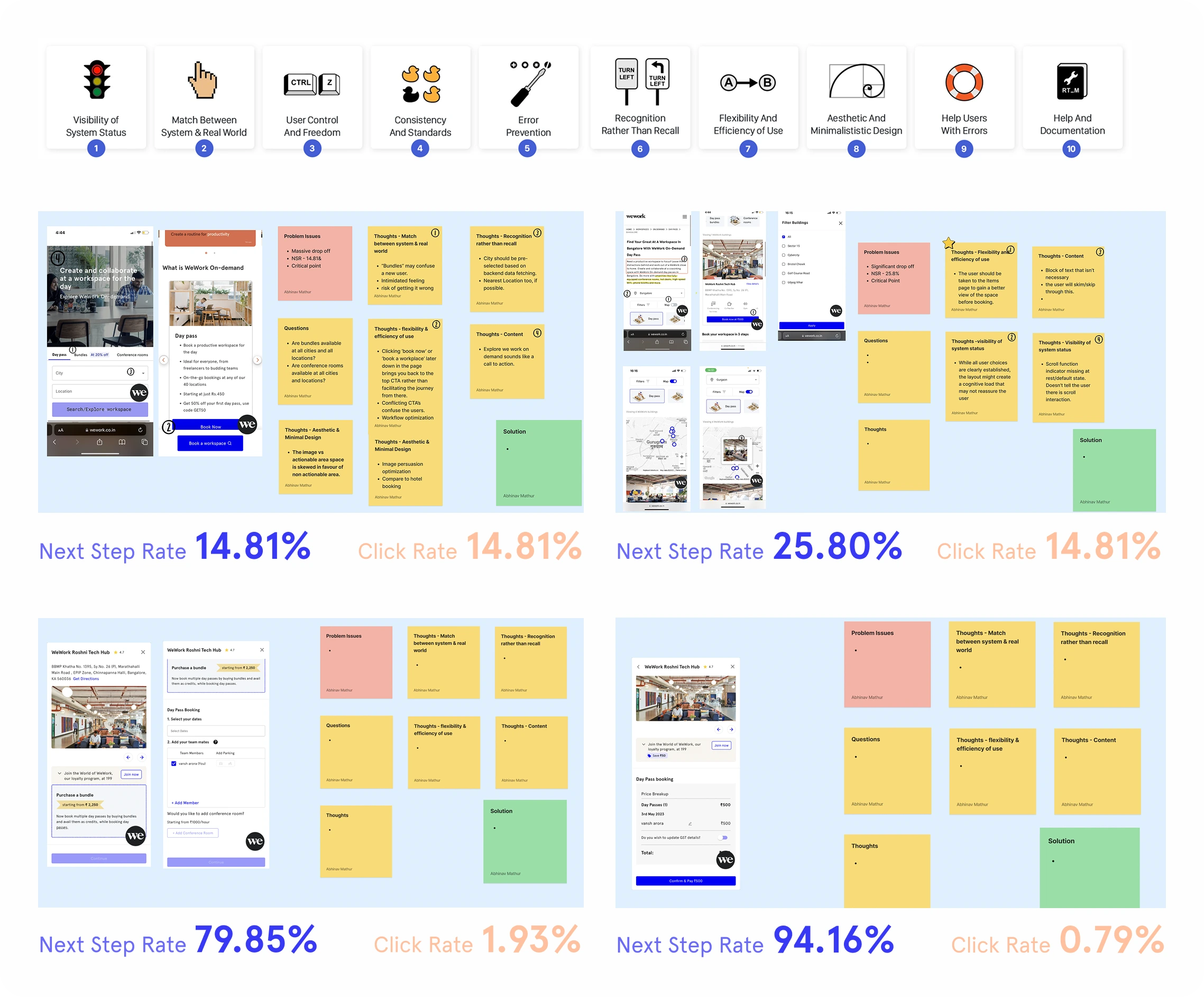
I started by reviewing the live site with heatmaps and funnel behavior, looking at two numbers across the key screens: how often people clicked, and how often they moved on to the next step. The pattern was uneven. Some views had a healthy next-step rate (up to 94.16%) while their click rate was under 1% (as low as 0.79% on one view and 1.93% on another). Elsewhere, next-step and click rates both sat around 14.81%. People were moving through pages without engaging with the content that should have been persuading them.
Device metrics
The split by device was lopsided, and it told me where to focus.
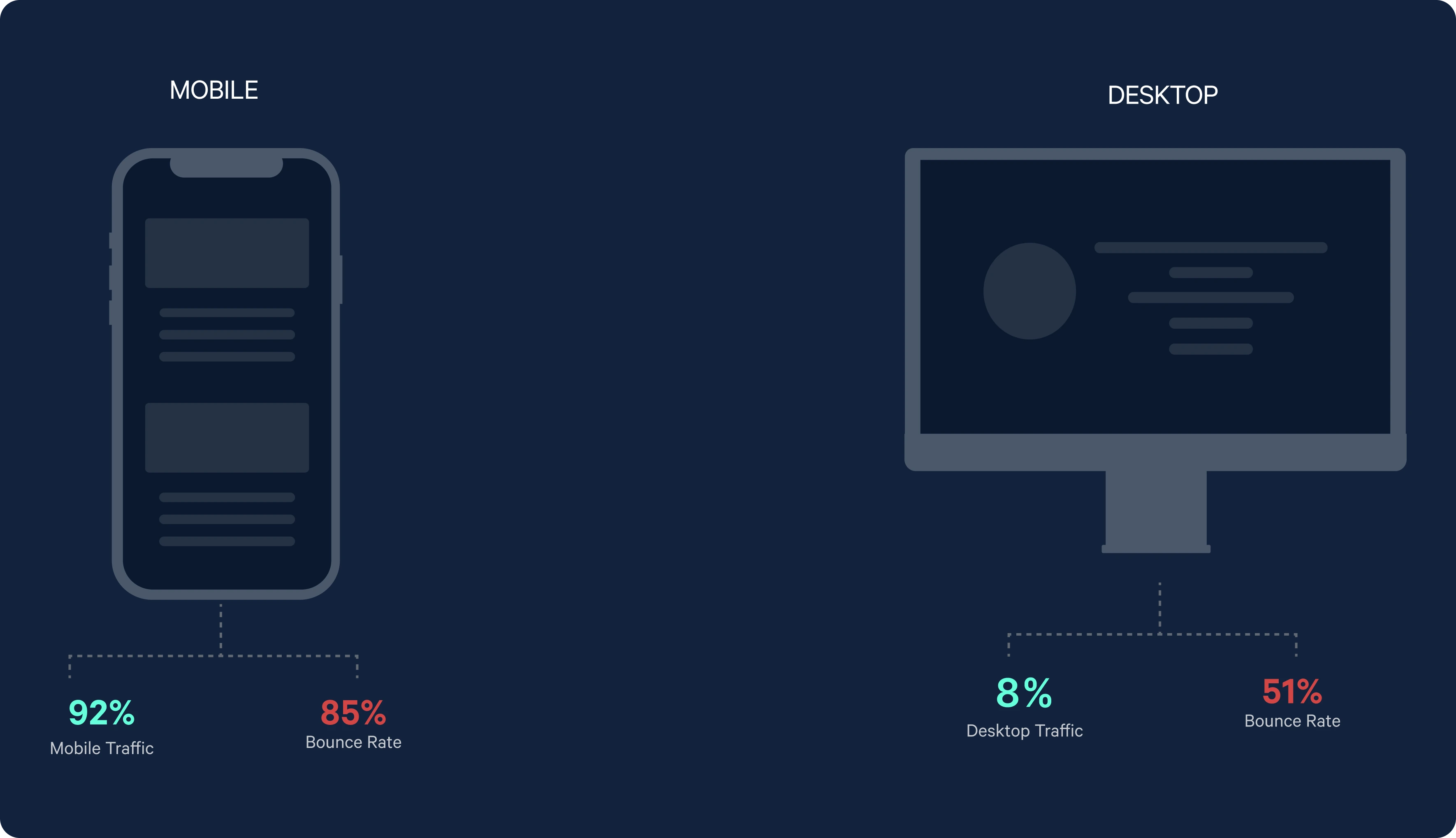
Nearly all visitors were on mobile, and that is where most of them left. The redesign therefore had to be mobile-first, with desktop treated as an equally polished second experience rather than the default.
User journey analysis
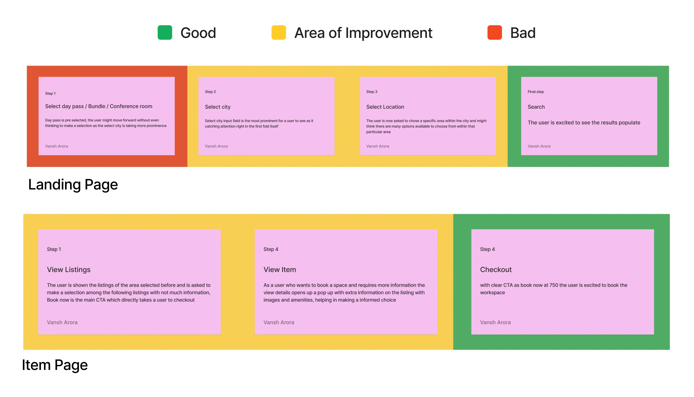
I mapped the landing page and the item page, marking what worked, what needed improvement and what failed. The main findings were:
• Users were asked to log in before seeing more details, benefits or reviews of the space.
• The mobile viewport was cluttered.
• The chatbot icon was unclear in purpose.
• The term “Bundles” was not understood.
• The team needed a deeper understanding of demand and motivation around co-working, not just the mechanics of booking.
Competitor and consumer analysis
I compared WeWork with three alternatives (MyHQ, Workflo and Regus), then looked at who actually buys On-Demand.
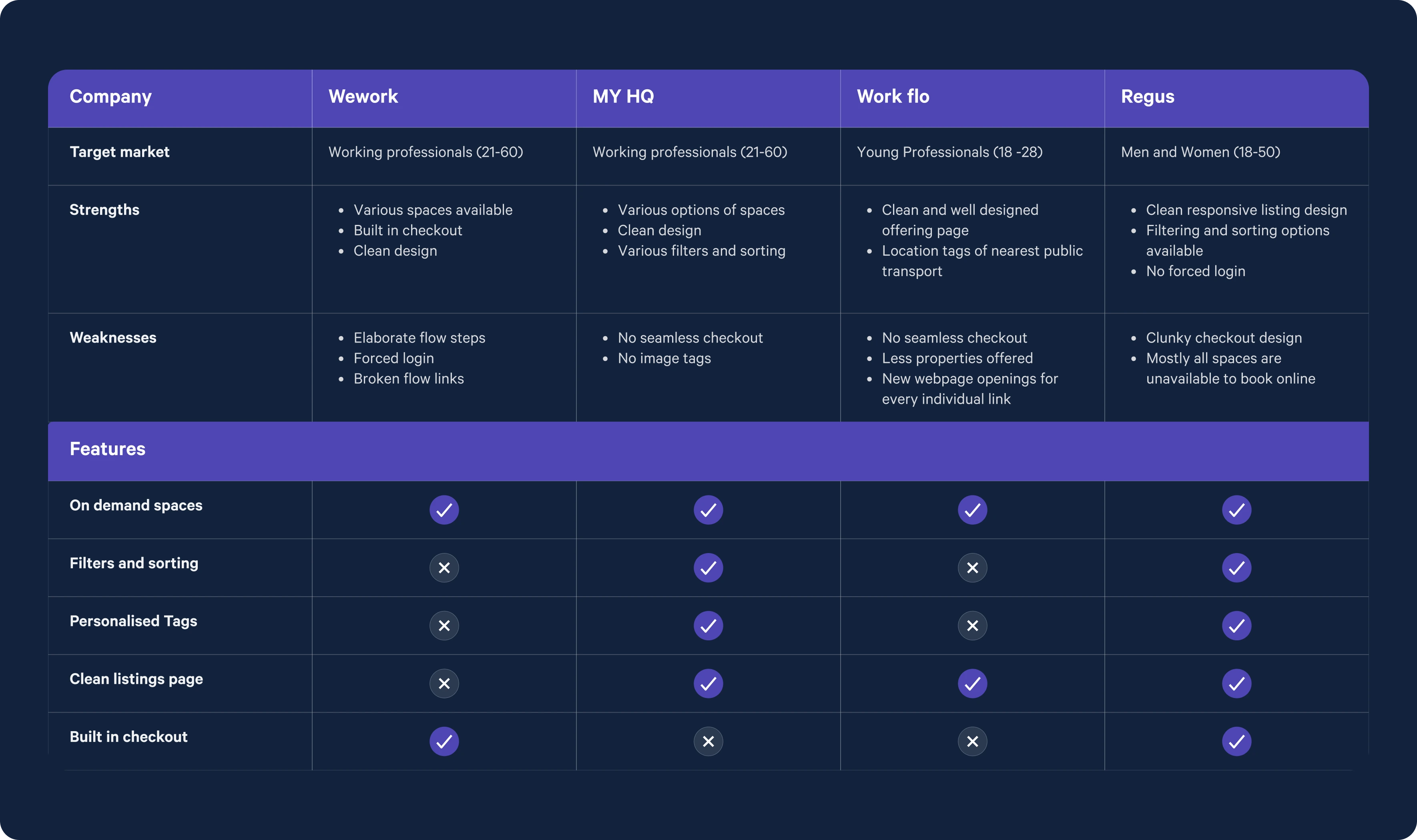
Feature coverage showed the gap clearly. WeWork offered on-demand spaces and built-in checkout, but competitors were ahead on filtering and sorting, personalised tags and clean listings pages.
Key takeaways:
1. The overall flow to purchase should be shortened and the persuasion increased.
2. MyHQ filters quickly within the listing page, which reduces time to purchase.
3. Workflo uses clean, minimal design with location tags and vibrant colors to speak to young professionals.
4. Regus has a clean listings page with filters and sorting, though checkout is not its priority.
Consumer analysis
Looking at who actually buys On-Demand:
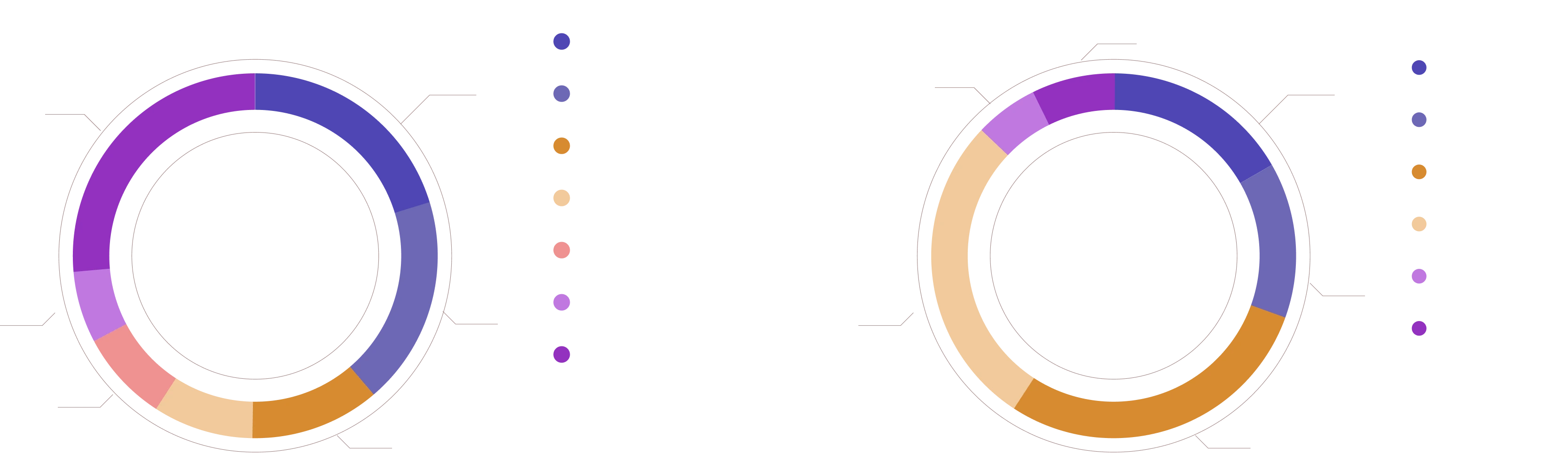
• The top three client industries form a healthy mix of business and creative groups.
• Management is the top job profile, with individual contributors a close second, followed by CEOs and founders.
• Most On-Demand clients have or work for an incorporated business, which signals real commitment rather than casual browsing.
This told me the audience is professional and purposeful, and wants speed and confidence more than inspiration.
User personas
Two personas captured the main motivations.
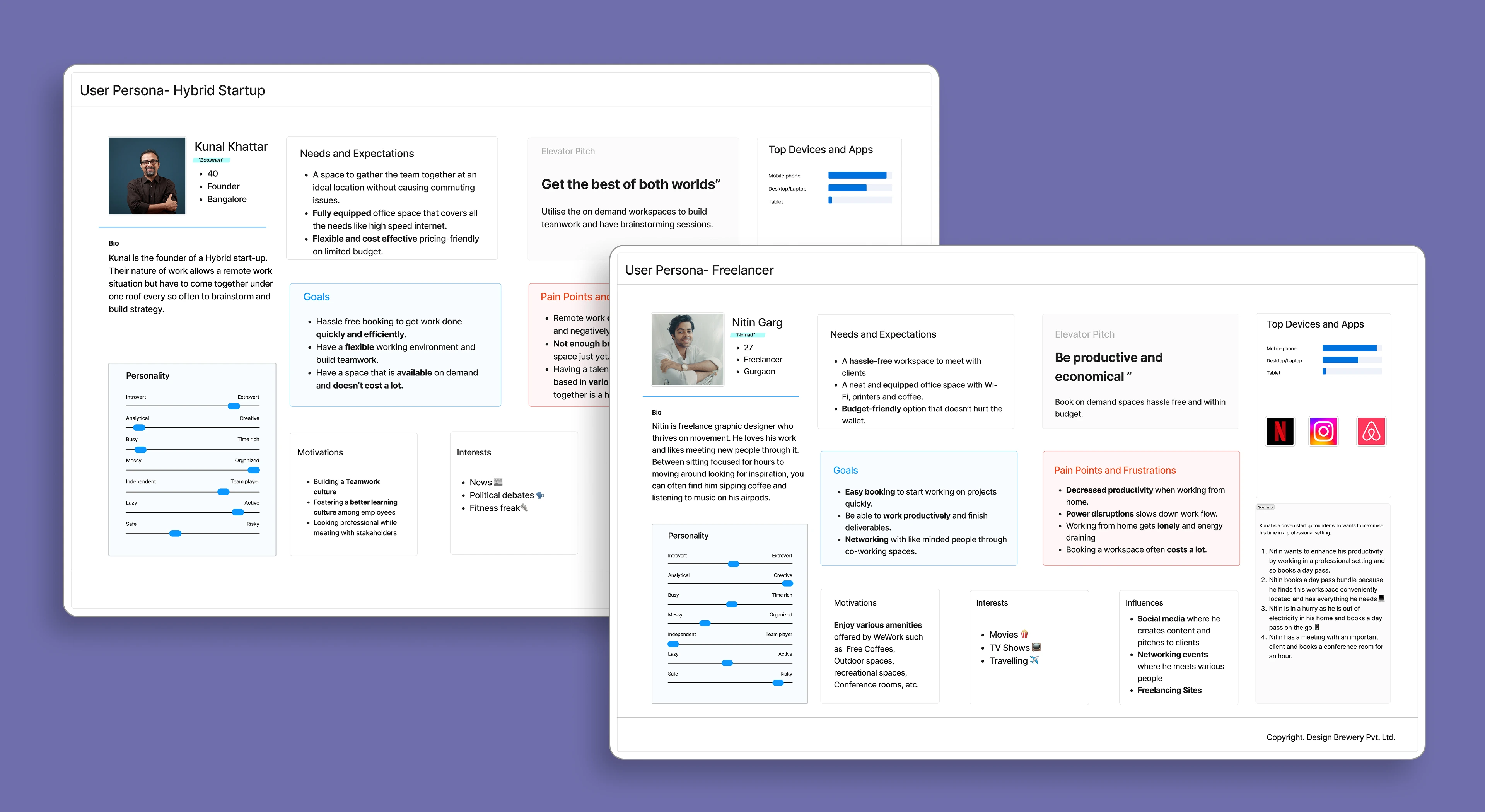
Workflow analysis
I mapped the existing booking workflow for each persona and found where it broke:
• “How it works” takes the user outside the journey to a separate FAQ page.
• The “Call us” call to action also pulls the user out of the flow.
• Once users leave, nothing encourages them to return or to book another space.
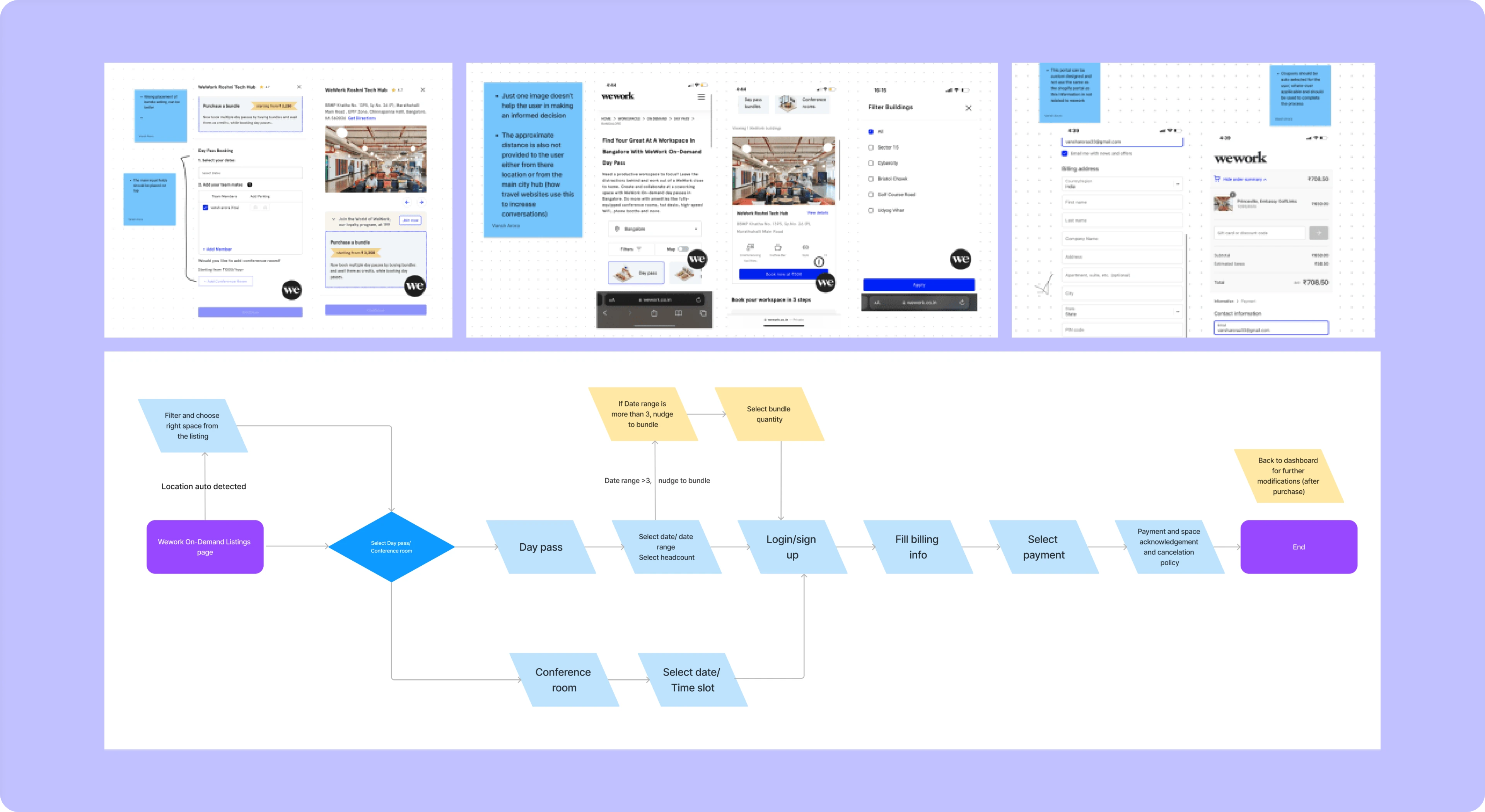
New workflow
I redesigned the flow to keep users inside a single, shorter path from discovery to confirmation. Information that used to live on external pages moved into the journey, filtering moved into the listing, and a clear next action was added after booking.
Mobile
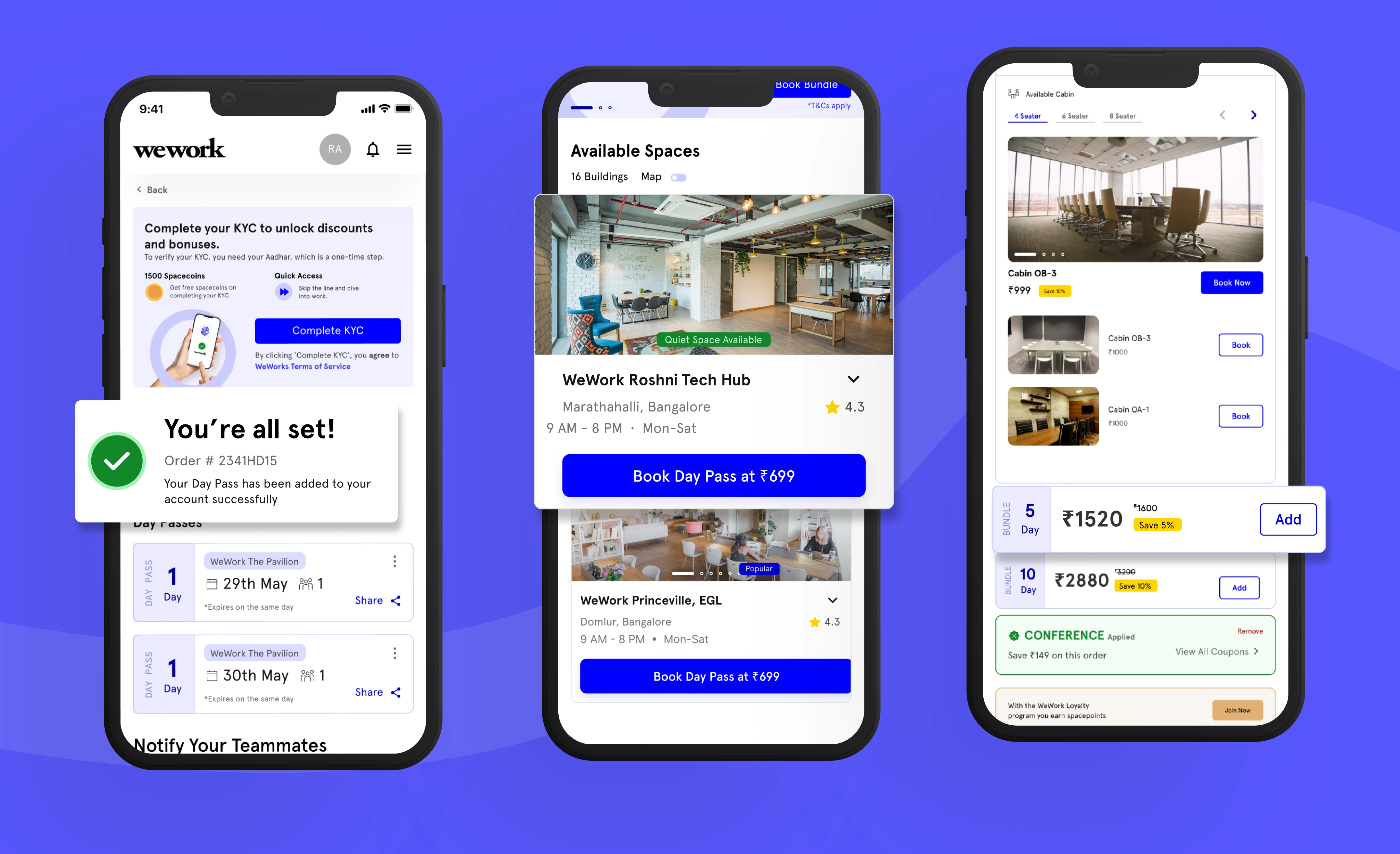
Because 92% of traffic was on mobile, I designed that experience first.
- Browse available spaces with real photography, ratings, location, hours and a prominent “Book Day Pass” action, plus status tags such as “Quiet space available”.
- Bundles made understandable, with a clear price and saving shown beside the option, for example a 5-day pass or a 10-day pass, so the term explains itself.
- Time-slot booking for cabins and conference rooms, with seat counts and per-slot pricing visible at a glance.
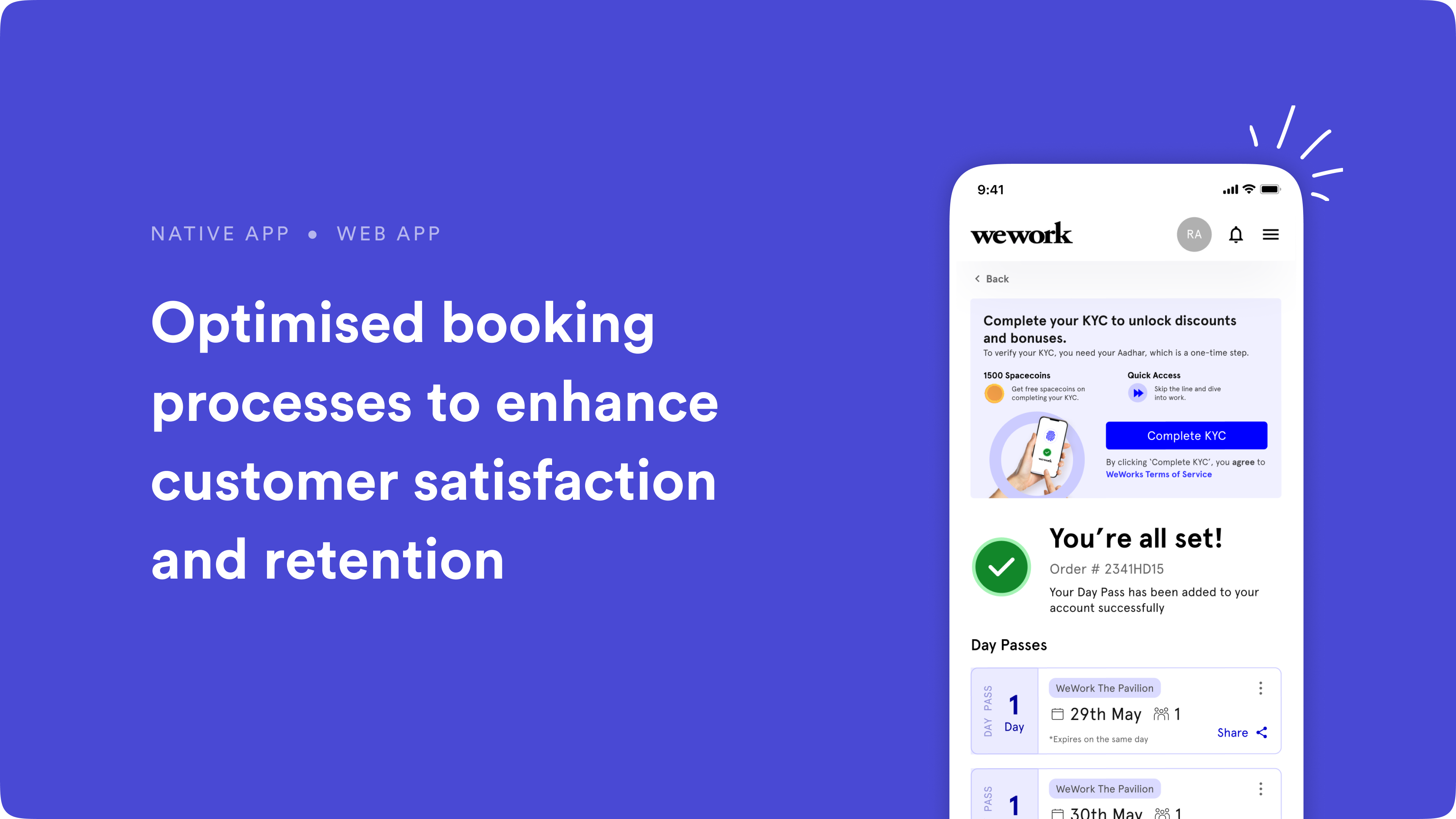
- A clear confirmation (“You’re all set!”) with the order number and the day passes shown straight away, followed by prompts to share the pass and notify teammates.
- KYC as an unlock, framed as a way to get discounts and bonuses, so identity verification reads as a benefit and not a roadblock.
Desktop
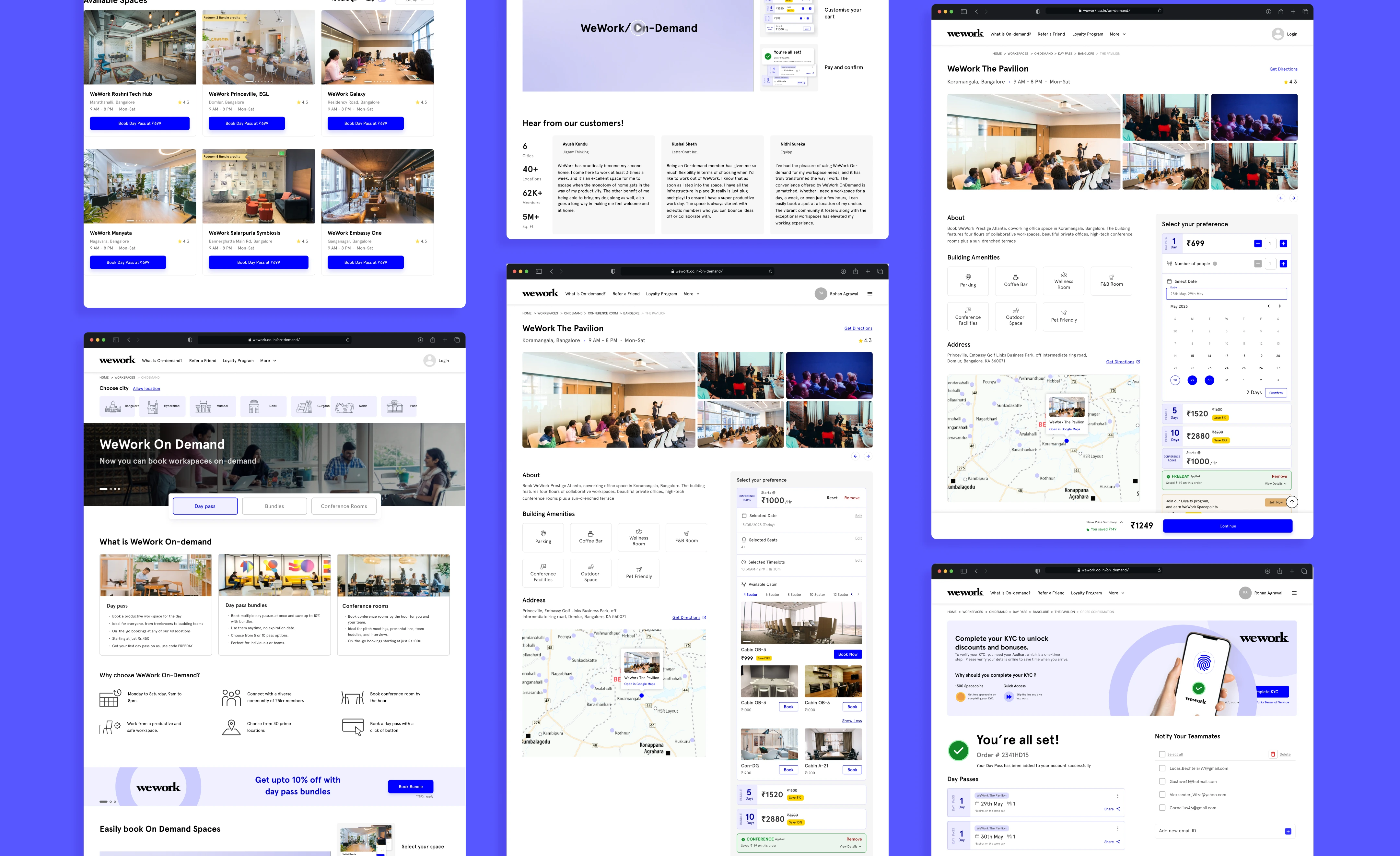
On desktop, I extended the same system to a larger canvas:
• A landing page that explains WeWork On-Demand, its day passes and its conference rooms, with a promotional banner for day pass bundles.
• A listings page with a richer grid of spaces.
• A detail page with a photo gallery, amenities, a map, a date picker and bundle pricing in one place.
• A confirmation page with day passes, a teammate-notification panel and help and support.
Outcome
The redesign delivered a mobile-first booking experience and a matching desktop experience, built on a shorter, self-contained workflow. It addresses every issue found in research: it removes the forced login before value is shown, declutters the mobile view, explains bundles clearly, and keeps users in the journey instead of sending them to external pages.
More Case Study